
A simple visual identity for your church: logo, colors and voice without hiring an agency
Build your church's visual identity in 5 steps: a simple logo, color palette, fonts, tone of voice and a one-page guide, with no agency and little cost.

In this article
- Visitors read the church before they hear the sermon
- Speaking to outsiders: what Paul asks of the Colossians
- A simple logo: clean it up before you redesign
- A color palette: rules for deciding without arguing about taste
- Readable fonts: what you gain and what you give up
- Tone of voice: a model announcement to copy
- A one-page guide: what goes in and how to fit it to your church
- Example: a church of 200 members with four logos
- Mistakes that undo an identity within months
- Signs the identity has taken hold
- Frequently asked questions
Free mind map
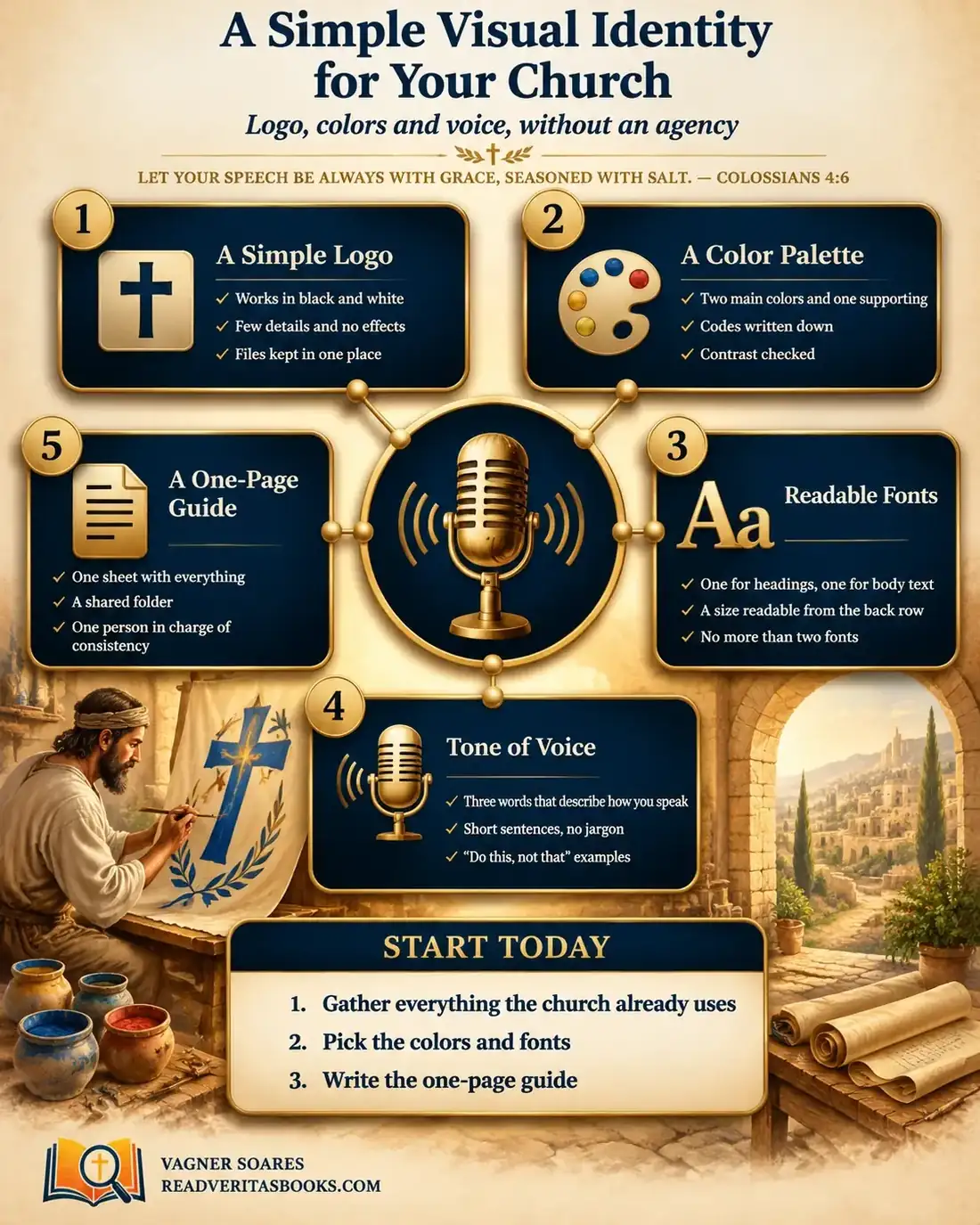
This whole guide on one page
The five steps in this article as an infographic you can print, pin on the notice board or send to your team.
In the same week, a visitor sees the church's invitation on Instagram, the poster on the bakery's notice board and the slide at the service. The invitation has a blue logo with a dove, the poster a red cross in another typeface, and the slide a third drawing. The visitor isn't sure it is the same church. Nobody decided this: it simply happened.
A church visual identity isn't a luxury for large churches. It is a decision, made once and written down, about how the church looks and how it speaks: a clean logo, a few colors, two fonts, a tone of voice and one sheet that holds it all. This guide shows how to do it without an agency, with two or three volunteers, in about three weeks.
Let your speech always be with grace, seasoned with salt
Colossians 4:6
Visitors read the church before they hear the sermon
A first-time visitor doesn't know your story. They know what they see: the social media profile, the sign on the building, the leaflet for vacation Bible school. Consistent materials say "people care here" before a word is spoken. Mismatched ones say "people improvise here", even when the heart behind them is excellent.
There is an internal gain too. When the rules are written down, the media volunteer stops asking which color to use on every poster, the children's ministry doesn't invent its own logo and the pastor no longer approves every design. Identity saves conversations.
Advertisement
Speaking to outsiders: what Paul asks of the Colossians
The opening verse was written by Paul in prison, near the end of his letter to the Colossians. After asking for prayer to make known the mystery of Christ, he turns to the church: "Walk in wisdom toward them that are without, redeeming the time. Let your speech be alway with grace, seasoned with salt, that ye may know how ye ought to answer every man" (Colossians 4:5-6). The subject is how believers behave and talk in front of people who do not yet believe.
The passage says nothing about logos, and it would be a stretch to claim Paul teaches design. He teaches that the church should think about outsiders when it speaks, with grace and in a way that fits each person. A harsh message or a poster only members understand fails right there.
In 1 Corinthians 14, Paul corrects a church where many spoke in tongues without interpretation. He uses the picture of a trumpet: "if the trumpet give an uncertain sound, who shall prepare himself to the battle?", and says that words not "easy to be understood" are like speaking "into the air" (1 Corinthians 14:8-9). He adds that the "unlearned, or unbelievers" coming in would say "that ye are mad" (1 Corinthians 14:23). The topic there is the use of gifts in worship, not institutional communication.
The principle still applies honestly to church administration: what the church produces should be understood by the people receiving it, including those who don't know the in-house vocabulary. And the chapter ends by asking that all things be done "decently and in order" (1 Corinthians 14:40).
A simple logo: clean it up before you redesign
In most churches the problem isn't a missing logo but too many versions of it. Before thinking about a new design, work through these steps in order:
- Gather every version in circulation: files on the office computer, images in group chats, the sign on the building, old T-shirts. Lay them side by side.
- Choose the version closest to the original symbol. If there is no agreement, take two options to the leadership to decide in a meeting, not in the hallway.
- Print that version in black and white. If it is still recognizable without color, the design is strong.
- Shrink it to the size of a profile picture on a phone. Fine details, shadows and gradients vanish: remove whatever doesn't survive.
- Ask a volunteer with some editing skills to redraw the clean symbol in vector format. If no one can, pay for that single task only.
- Export three variations (color, all white and all black), as PNG with a transparent background and as PDF or SVG.
- Keep everything in one shared folder and archive the old versions so no one uses them by mistake.
Creating a church logo from scratch only makes sense when the current one fails steps 3 and 4 even after cleaning, or when it communicates something the church no longer wants to say. In that case, treat it as a leadership decision with a deadline and someone in charge.
A color palette: rules for deciding without arguing about taste
Choosing church colors easily turns into a contest of preferences. The team can decide by rules instead:
- If the logo already has a strong, familiar color, that is the main color. Don't change what the neighborhood already recognizes.
- If the logo is only black or only a line drawing, choose the main color by looking at the sanctuary and the building, where people will actually arrive.
- If two colors compete for first place, keep the one that reads better with white text on top and use the other as the supporting color.
- If a color looks good on screen but fades on paper, it is out. Test it in print and on a phone.
- If a ministry asks for its own color, use the church palette in a different proportion instead of creating a parallel palette.
The result fits in three lines: a main color for highlights, a neutral for backgrounds and text, and a supporting color for details. Write down each code (for example, #1F3A5F) so anyone can use exactly the same shade. And on any color, use dark text on a light background or light text on a dark one, never light letters on a vivid color.
Advertisement
Readable fonts: what you gain and what you give up
Every font choice has a cost. A decorative font gives a headline personality, but it tires the eye in a three-line announcement and becomes unreadable on a slide seen from the back. A plain one works everywhere but alone leaves materials without character. So the usual pairing is one font with more character for headings and a very plain one for body text.
There is also a trade-off between paid and free fonts. A paid font works only on the computer of the person who holds the license, and the poster stalls when that person is away. Fonts from open libraries such as Google Fonts can be installed by any volunteer; even so, check the license before printing.
Watch for three warning signs: slides that can only be read from the front row (the test is to sit in the back row), long texts in capital letters, which read like shouting, and the third font that appears "just for this event".
Tone of voice: a model announcement to copy
The church's tone of voice is the way it speaks in announcements, captions and messages. The same church can sound welcoming at the service and bossy in the group chat. Choose three words that describe how you speak, for example welcoming, clear and hopeful, and write examples the team can imitate.
An off-tone announcement, as it often appears:
- "ATTENTION EVERYONE!!! Choir rehearsal Saturday. Anyone missing without a reason will be taken off the rota. The leadership."
The same announcement in the chosen tone:
- "Choir, our rehearsal is this Saturday at 4 p.m. in the downstairs hall. If you can't make it, let the coordinator know by Friday so we can adjust the rota. Thank you for serving with us!"
An invitation for visitors, ready to adapt:
- "This Sunday at 6 p.m. we have a service planned for people who have never been. Come as you are. At the door, someone from the welcome team will greet you and show you where to sit."
Notice what changed: short sentences, complete information (day, time, place), no insider terms, and a request instead of a threat. Keep these "do this, not that" pairs with the guide.
A one-page guide: what goes in and how to fit it to your church
A church brand guide doesn't need to be a booklet. One page is enough if it includes: the logo in its three variations and what not to do with it (stretch it, recolor it, place it over a busy photo); the three colors with codes; the two fonts and where each is used; the three tone words with one example; the location of the shared folder; and the name of the person who answers questions.
In a small church, up to about 100 people, the sheet is enough. One person looks after the folder and prepares two or three ready-made templates (announcement, invitation, notices slide).
In a medium-sized church, the guide stays at one page, but each ministry gets a subfolder of templates, all in the same palette. Show the guide in person to each ministry leader, because that is where parallel logos are born.
In a large church with a communications team, the page becomes the cover of a longer document, still readable in two minutes. Review the guide once a year.
Example: a church of 200 members with four logos
Consider a church of 200 members in a residential neighborhood. The leadership notices that four versions of the logo are in circulation, the youth group uses neon colors for everything and announcements in the group chat are written in capitals. The pastor invites three people: the volunteer who makes the graphics, the church secretary and a children's ministry teacher.
In the first week, after the Sunday service, they spread out on a table everything the church has produced in recent months. They photograph the table and write down: four logos, nine colors, five fonts. Nobody is blamed.
In the second week, the volunteer runs the logo test. The oldest version, with a simple line, passes in black and white and at profile-picture size. She redraws it and exports the three variations. Following the color rules, they keep the navy blue already on the building, a light gray for backgrounds and a warm yellow as the supporting color, which the youth adopt for their events.
In the third week, the secretary rewrites the three most frequent announcements (rehearsal, prayer meeting and visitors' service) using the chosen words. The group puts the guide together, creates the shared folder and names the secretary as the person for questions. At the next board meeting, the pastor presents the guide in ten minutes and the minutes record its approval.
Two months later, the secretary notes: one logo in use and only one poster off the standard, redone with the template.
Mistakes that undo an identity within months
The most common mistake is treating the guide as finished work. The sheet is approved, nobody presents it to the ministries and, a few months later, the parallel logos are back. Leave ready-made templates in the folder: following a template is easier than reading a rule.
Another mistake is changing the logo out of personal taste with each new leadership: recognition comes from repetition. Copying a famous church's identity doesn't help either, because the visitor from your neighborhood needs to see your story.
Signs the identity has taken hold
- A new volunteer makes a poster without asking which color to use.
- Ministries ask for templates from the folder instead of designing from scratch.
- Group chat announcements include day, time and place, and nobody writes in capitals.
- The pastor no longer approves every design, and slips are fixed with a short conversation.
Frequently asked questions
Do I need to hire a designer to make the church logo?
Not necessarily. If the current symbol is simple, cleaning it up and exporting good versions solves most of the problem. To create one from scratch a designer helps, but it can be a one-off job.
How many colors should a church use?
Three work well for most churches: a main color, a neutral and a supporting color. More than that makes consistency hard when many volunteers produce materials.
Can I use images and fonts downloaded from the internet?
Only if the license allows the use you have in mind. Prefer free libraries and read the terms, especially for printed material or campaigns.
Do we need to register the church logo as a trademark?
It depends on the country and on the risk of someone misusing the name and symbol. Trademark rules vary, so check with a local lawyer before deciding. Day to day, what matters most is keeping the official files safe and having the guide approved in the minutes.
Visual identity, at heart, is care for the person arriving: making clear who we are before we say a word. To keep going, see why nobody reads the church's posts, organize your internal communication, learn basic SEO for the church website, explore free tools for small churches and read the complete guide to church marketing and communication.

Vagner Soares is a presbyter with pastoral ordination, a mentor and a digital entrepreneur with more than 10 years of experience in technology, digital marketing and education.
Keep reading
 Marketing and communicationBasic SEO for the church website: show up for people searching in your neighborhoodLearn basic SEO for your church website: local keywords, titles, site speed, fresh content and Google Business Profile so neighbors can find you.Read the article
 Marketing and communicationInternal Communication: How to Make Sure Everyone at Church Knows What's HappeningOrganize church internal communication with one official channel, a newsletter on a fixed day, and clear posting rules, so no one says they never heard.Read the article
 Marketing and communication · Reference guideComplete guide to marketing and communication for churches: from identity to distributionA complete guide to church communication: identity and voice, a content calendar, digital channels, handling image crises and the metrics that matter.Read the article